
Quantum Leap University Logos and Branding
I was asked by Quantum Leap University to redesign their existing company logo, as well as the logos for their training products. You will notice that Quantum Leap University's existing logos did not scale well, due to the file format. For this reason, I chose to use Adobe Illustrator when redesigning the logos. I wanted to use vectors so that their logos would be far more scalable. The existing logos also failed to create a cohesive brand for the company, something that we determined was important to the company’s marketing goals.
I began the process by looking at the company’s logos and determining what was salvageable, what needed a complete redesign, and how I could integrate features into each logo that would become subtle markers for the company as a whole. Quantum Leap University’s most recognizable product is the C.O.R.E. personality profile system. So I determined that the C.O.R.E. logo, would be used as the foundation for all other logos.
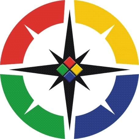
I only made minor changes and improvements to the existing C.O.R.E. logo. The primary objective was to create a vector form of the existing logo. In the process it was determined that minor color adjustments were necessary to create the visual pop that was desired. Essentially, we increased the saturation of each color as well as adjusting the colors of bevels on each of the central diamonds.

After finishing the update to the C.O.R.E. logo I was prepared to integrate features from its design into the other logos. The Quantum Leap University “Quantum Cube” logo, was the first to get the update treatment.

The Quantum Cube was already using the existing four color quadrants design of the C.O.R.E. logo. However, the color order did not match properly so I reorganized the colors to align with those on the C.O.R.E. logo. I also felt that the energy burst design was cool but messy, so I decided to streamline it by replacing it with a white compass rose taken from the C.O.R.E. logo and removing the “bubbles” which I felt were a distraction. I also added the QLU text in layered directly in front which is an abbreviation that Quantum Leap University regularly uses. As with all my logo designs, I was careful to create detailed layer groupings, such as the QLU abbreviation, so that elements can be added and removed with ease.

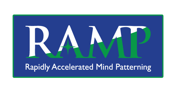
The RAMP logo needed the most work. The original image file was very small and could not be scaled with ease, creating major issues with modern dynamic web design. I also felt that the image in the background was very distracting, making the text difficult to read.

In my design, I wanted to include an allusion to the firing synapses from the original image without all the clutter. I was able to achieve this by replacing the crossbar of the ‘A’ with the compass rose design found in both of the other updated logos. The client wanted to maintain a color scheme similar to the old RAMP logo, so I used the same green and blue found in the updated C.O.R.E. logo in order to help establish strong brand recognition.
The original Success GPS logo was created using stock art and simple font placed on top of a jpeg. This is problematic for numerous reasons when dealing with web and print use. I also felt that it was less of a logo and more of a "graphic". So I went out on a limb and created two versions: one that is more of a graphic representation of an actual GPS unit, as well as a "true logo" with a more versatile, clean design.

For the updated graphic, I used C.O.R.E. colors primarily, as well as the compass rose. I attempted to give it a design similar to Google Maps which is perhaps the most commonly used GPS software and thus instantly recognizable.

For the logo version, I wanted to evoke clear elements of a GPS system without having to draw out the whole picture. This makes for a cleaner, more iconic logo that is far more versatile and professional in business situations. Ultimately, the client was so pleased with the design that they decided to begin the transition to using this as their primary logo.

This last logo is for the company's new FIRE program which was without a logo. They asked that I create something that would fit the brand and they wanted to use a "flame" or a "phoenix", so I gave them both. I created a colorful flame design that evokes the image of a phoenix. I drew from the C.O.R.E. logo again using a compass rose for the ember/eye of the phoenix. This logo is designed to be used with the modified font or as a standalone icon.
