
Wedding Stationary
This custom, Kansas inspired stationery was designed for my October 1st, 2016 wedding. My wife and I wanted a unique set of stationery that tied in our wedding colors and the rustic feel of our wedding without going overboard on either; subtlety was key. The fact that her shoes matched the invitations so perfectly was quite the crazy coincidence!

You may have noticed the embossed image on the invitation above. I created the below image in Adobe Illustrator and then had it made into a dry embossing plate via a vendor on Etsy. The graphic font is comprised of the Kansas state motto “Ad Astra Per Aspera” followed by an additional phrase “Amore Regente”. The phrase translates as “To the stars through difficulty guided by love”. The word Aspera is masked in a way that gives it the general shape of the state of Kansas, and of course there is a star resting just above what would be the north-eastern border of the state.

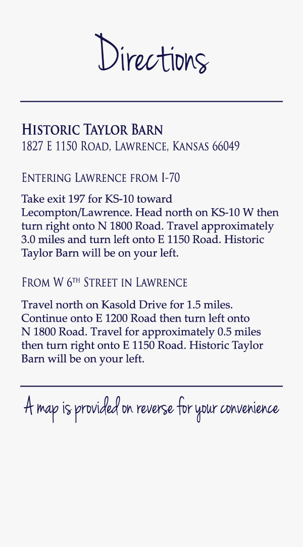
There were two cards included in the pocketfold envelope with the main invitation. A ‘Wedding Details’ card that gave information about the wedding website, the wedding registry, and hotel block reservation information. There was also a ‘Directions’ card which had both a front and back side. On the front, there was a wedding venue name and address for those using a GPS, as well as written directions for out of town guests coming from either direction.
On the back side of the ‘Directions’ card was a partial map of Lawrence, Kansas including key roads, a few major landmark icons, and a compass rose all created in Adobe Illustrator.

Table number cards were created using Adobe Illustrator and printed on hand stamped sheets of cardstock. I arranged the cards so that six printed on each sheet, eliminating both ink and paper waste. It also served the added bonus of granting visual interest by creating a variety of stamp locations for each card. I modified the font for the word ‘table’ so that it created a recurring pattern which allowed for it to seamlessly flow from edge to edge.

Individually designed place setting cards were created using Adobe Illustrator and printed on hand stamped sheets of cardstock. I arranged the cards so that nine printed on each sheet, eliminating both ink and paper waste. It also served the added bonus of granting visual interest by creating a variety of stamp locations for each card. In addition, each individual’s first and last names were uniquely arranged on the cards in a visually pleasing way.

Credit for photos goes to the fantastic Melissa Sigler Porter of